Tuesday, December 1, 2009

Week 13-Visual Techniques

Figure 1. Intricacy, Boldness, Accent, Symmetry, Asymmetry, Variation, Randomness.

Figure 2. Transparency, Boldness, Accent, Spontaneity, Activeness, Flatness, Randomness, Economy.

In the first example, Figure 1, the image is very intricate. The lines are curvy and decedent. The character at the top really stands out which is the technique of boldness.The red color gives off an accent as it stands out from the black that is being used throughout the image. It's being perceived as something beautiful. Whereas in Figure 2, there is more of simplicity taking place. While it looks like there is a lot going on there is actually very minimal use of elements. The boldness technique is at the bottom and the image looks like there is a lot going on but the elements are very simple, which is the use of economy. Both the images have to visual technique of randomness and activeness with the placing of characters and designs. Each image uses the techniques very well to create an attractive composition.


Tuesday, November 10, 2009

WEEK 11 Contrast


This visual communication image displays the example of contrast in color. The way contrast is working in this picture is that the blue letters spell out the word "Lost" and the black letters still allow us to read the word "Found". There contrast in color is key for us to be able to read the designers goal in this graphic, which is for us to read "Lost and Found". It is a visual play on words that lets the viewer read "Lost and found" in a creative way. The blue stands out and separates itself from the black letters and the white background. Overall, the color creates a "pop out" effect that makes the distinction.

In the graphic design above displays an example of poor contrast in color. The composition uses mostly cool colors. The type is where this image lacks contrast. The color of the type is so similar to the background that it does not stand out. The designer could use more warm colors so that the colors compliment each other. Perhaps yellow so it can stand out on the purple.

Tuesday, November 3, 2009

Implied Motion in 2D Graphics

This graphic image implies motion with diagonal lines making stress. The lines go in partnership with direction. The colored lines appear to being going in the same direction. There is also a blur in this image that implies that there is fast motion taking place. The image has energy of movement.


In this graphic design poster contains the element of implied motion. The box on the top of the other boxes appears to be falling. This is implied motion of expectation; we expect that the box will fall even though the box is not moving at all. The person is also holding the boxes at a diagonal create stress which is also involved with implied motion.


Tuesday, October 27, 2009

Dimension/Depth

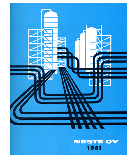
Here is a graphic design example that contains elements of dimension and depth. There is good example of linear perspective in this image. in the center the road or train tracks lead into a vanishing point. This creates depth and dimension like it is a representation of what we see. There is also the element of overlapping to create dimension. The structures overlap and have relative size and relative height. The lines in this image create a texture gradient as well as the buildings or structures have some texture gradient as well.

Tuesday, October 20, 2009

Tone and Color-Typography


Tone is operating at the lower section of this typography poster. There are different tones of blue to represent a wavy body of water. The blue goes from dark to light. The lighter blue makes the image look like light is reflecting off the water.
The tone is interacting with the basic element dot. The type in this image play a role as a dot to make up a whole image.
Hue is active in this image. The red, yellow, orange that make up the sunlight. Hue is the color it self and in this image the colors are going in order of the color wheel: red, orange, yellow. Color is in interaction with the basic element line. Each hue is moving in a line to create the image of sunrays moving outward. Dondis describes line as giving a direction and that is what is taking place in this image.

Saturday, October 10, 2009

Typography Design


The basic element of visual communication used in this image is direction. There is use of the diagonal line, which gives meaning to the image. It creates action in the overall image and that is one of the characteristics that is used to describe direction that is moving diagonally. Direction is often associated with movement, which is another element of visual communication and is used here in the image. This image has action and movement that gives off an exciting effect. It makes the subject interesting and intriguing. I want to know what this book is about because of the direction of the lines.


This image has the basic element of tone. The words over lap to create the feeling of tone. In the center the words are concentrated together, which makes the area appear dark. Moving outside the area, the words become less concentrated and make the area lighter. Hence the appearance of tone. There is a juxtaposition of light and dark clearly displayed in this image. The use of this element gives a nice effect for the image because it creates a point of message "Don't mistake legibility for communication". We can't read the words that are creating the tone effect, so it compliments the message.


In this image there is use of the basic element called shape. The obvious shape used here is the square. The image overall is simple, straight, and somewhat dull. That is what the Dondis describes the square to be: "dullness, honesty, straightness, and workmanlike meaning" (44). The element of shape in this image corresponds with the text "Making and Breaking the Grid". The squares build to made a grid pattern, which also brings in the element of line.


Tuesday, October 6, 2009

Week 6 exercise-Syntactical Guidlines

Good Design

This is a picture of where the syntactical guidelines work for the targeted user. The wheels are symmetrical, which create balance for the user. The bicycle is functional and desirable to use. Even though there is balance, it is not boring to look at this bicycle with its variation of shapes involved. Such as, the lines that run diagonal, the chain wheel and the wheels and tires. The attraction and grouping is created with grouping a relationship between the two wheels. The wheels are the dominate element of this bicycle, the positive, and the frame of the bike is the passive negative element of the design.


Bad Design


Here is an example of where the syntactical guidelines were put to bad use. This bike could be functional, however it is not for the typical road biker. The chain wheel is extremely big. It creates a sense of imbalance because on the left there is two circle shapes and on the right there is only one. All the stress is put on the big chain wheel. This bicycle wouldn't be very fun to ride up a hill.